Sunday, 19 February 2017

Saturday, 18 February 2017
Friday, 17 February 2017
Thursday, 16 February 2017
Evaluation- Question 3
This demography of the target audience is a full-time student around the age of 16-19 living at home but has a part time job. This allows them to spend their earning on things they are interested in and things they like such as music and clothing instead of bills and so on. The target audience is likely to attend festivals such as V festival and also local gigs to listen to new upcoming artists. The listener of this genre is also less likely to live in a major city like London and are more likely to be in a place like Manchester due to the area being localised and not very mainstream. The target audience is not into any specific brands instead they shop at different shops and buy what they like and what suits them, they are also very interested in expressing themselves through their clothes and the different colours they wear. They are also not interested in mainstream fashion instead they do their own things.
Evaluation- Question 3 Audience feedback 1
What have you learned from your audience feedback?


The first feedback we gained from the target group outlined the clear positives and negatives that were present in the production. The main thing that stood out from the begging was the clear narrative and the emotions that we wanted the audience to feel. This was a very good thing as it meant that we covered the main convention of our genre which is the narrative and emotions in the lyrics. The variety of shots were also good meaning they made the narrative very clear.
However, the feedback that we gained showed that we needed to add effects to make the video more interesting so the viewers do not lose interest and stop watching very early on. There were also many shots that needed to be re-filmed due to lack of lighting making some of the shots unclear. The lip sync was also an issue as it was not done up to professional standards, this also needed to be re-filmed as the singer sometimes sang too fast or too slow making the lip sync very out of beat.
The different shots also needed to cut to the beat in order to match the rhythm with the shots and make the music video flow much better. Many shots where the guitar was included also needed to be re-filmed as the artist was not putting much emphasis on it and made it look boring.
Evaluation- Question 3 Audience feedback 2


Once we improved the video depending on the criticism we got we added the black and white filters which made the narrative even more clear and interesting as it was not all one colour and boring. The close up which we added of the guitar were also another positive which the audience liked which was great as it was another convention of the genre.
Wednesday, 15 February 2017
Evaluation- Question 4
How did you use media technologies in the construction, and research,
planning and evaluation stages?
Website update 5
After looking at the website I have realised it did not have the music video which was the main focus of the production tasks, due to this I have added the video on the main page as well as on a subpage under the listen tab.


Tuesday, 14 February 2017
Website Update 5
The last thing I did was make all the merchandise in the shop section and add it to the website as well as link all the other social media sites to the website itself.

Saturday, 11 February 2017
Website Update 4
I have added a gallery in order to keep the website personal to the artists as it is almost like a diary of the different things the band has experienced.

Thursday, 9 February 2017
Website Update 3
I have added in all the tour dates as well as arenas and stadium. I have also linked in ticket master to the "buy tickets button". By doing this I am able to give fans the exact dates and details on when they can see the artist live,

Tuesday, 7 February 2017
Website Update 2
I added the listen section of the website. I then uploaded the album to it and made it available to the fans through download or they can listen to it on the website. I have also made it possible for them to share the music through other social media sites.

Monday, 6 February 2017
Website Update 1
The first thing I did was put the different pages that will be in the website in order for me to know what has been done and what I needed to do.
I then added a home page, I made this very simple as it needed to be easy to navigate. I made the front image a picture of the main person in the band and used the symbolic text I have been using throughout the digipak. I also added a subscribe button for fans to sign up in order to get updates about the band.
I then added a home page, I made this very simple as it needed to be easy to navigate. I made the front image a picture of the main person in the band and used the symbolic text I have been using throughout the digipak. I also added a subscribe button for fans to sign up in order to get updates about the band.

I wanted to give this website a personal touch and in order to do that I needed the audience to connect with the artists. to do this I have added a band section where the artists have a short explanation to why they love this album and how personal it is to them. I have also chosen to use both the guitarist and the main singer here as they make up the band.

I have decided that the background will stay the same open grounds throughout the website to allow the theme of nature to be found throughout the productions
Sunday, 5 February 2017
Website Initial Ideas
- I would like to have the pop up which is found on the Mumford & Sons website to attract attention to the digipak and the new album.
- The over all theme will be nature as it sticks to the codes and conventions of the genre while keeping a link between the digipak, website and the visuals used in the music video.
- I am going to have the same tabs as a classic website, home, band, listen, tour, gallery and shops. This will allow easy navigation throughout the website.
- The gallery will have images of the band during different jobs such as performing or filming to show the fans what they have been getting up to.
Saturday, 4 February 2017
Website Analysis- Mumford & Sons
The first thing that you see when you enter the website is a pop up about their new music making any visitor aware that they have new music out and that they buy it.

although it has stuck to the codes and conventions of websites there are still some unusual things about it is the use of colours. The bold colours on a black background really make things stand out while keeping a unique theme to it.

When you continue on the website the same design that is used in all other music websites is there, However, there are some extra tabs such as the forums which are chats which the fans themselves have created this allows their fans all over the world to connect and share their love for the band.

Friday, 3 February 2017
Website Analysis- Passenger
Passenger's website follows the main features of a musician's website, it is easy to navigate, links in with other social media sites has a particular theme as well as a shop section.

The home page is very simple and follows the codes and conventions of nature as it is the main focus. It has his latest music project in order to keep fans updated on what is going on. The tabs found at the top of the site make it very easy to navigate the site.

This website has a very personal feel to it as there is a tab for news which is articles and updates written by the artist himself and his opinions about things such as politics and experiences on tour

The music tab is filled with every musical project passenger has every worked on this makes it very easy for fans to keep up with all hi music as well as allow new fans to connect with him through all his previous work.

A very unusual thing to see on artist's website is a lyric section however it is included in this website which adds to making the websites person as it shows just how important hiss work is to him and how his lyrics are about his experiences.
A theme that has been carried out through this website is nature and water, this is also done by having a blue undertone to everything on this website. By using the colour blue a lot the website has a dark feel to it which link in with his emotional songs.
Wednesday, 1 February 2017
Codes and Conventions of Website
I have researched into the codes and conventions of a website in order to help me design and produce my website later on.
Thursday, 26 January 2017

Digipak CD- Image
I started by pasting the finished right of the digipak onto the background as I am planning to have the CD and the background the same.

I then cut the main circle for the CD out of the image. After doing so I copied the circle and pasted it on another layer in order to delete the excess part of the image.


I then repeated the same process with the hole in the middle. However, I removed the background too in order to make the hole transparent.`


Digipak Inside Right- Images
I started by copying the image into a separate layer to the background and resized it to get the detail that I wanted it to have.

I then added a filter to carry on with the theme that was running throughout the digipak.

Tuesday, 24 January 2017

Digipak Inside Left- Improvements
After viewing the final design for the digipak I have decided to change a few things in order to make it more representative.
I have used a font from photoshop in order to have more flexibility when editing as well as making it more clear when reading it.
I have also shrunk the picture as the original image was enlarged and the faces were elongated and looked abnormal.
I moved the name of the song in order to give the lyrics more space to make them bigger and readable.
Digipak Inside Left- Text
I pasted the name of the single "let her go" and removed the background of the text.

I then resized it to fit in the place I wanted it to.

I then pasted the lyrics onto the digipak and edited it to fit the exact place I had planned it to fit.

Digipak Front- Improvements
After looking at the digipak I have decided to change a few things in order to make the digipak look more appealing as well as well put together.
I moved the text from the middle to the side in order to make it stand out, I also used a font from photoshop in order to give me more flexibility when editing the font.
I also used colour correct in order to brighten the artists face and make his features clearer
I moved the text from the middle to the side in order to make it stand out, I also used a font from photoshop in order to give me more flexibility when editing the font.
I also used colour correct in order to brighten the artists face and make his features clearer
Digipak Inside Left- Image
I started by making the background and adding the images which had to be made smaller in order to fit on the digipak.

I then added the effect to allow the theme of the digipak to be carried out throughout the whole digipak.


Digipak Front- Text
I then added the text, removed the background and made it smaller in order for it to fit the place I have planned for it to fit.

I then added the album name and removed the background and edited it in order for it to fit where I had planned it to.


Dgipak Front- Image
I started my digipak by putting the measurements of the digipak onto photoshop in order to layer everything on top of it.

I then placed the image on another layer which I wanted to use on the background, however due to the size being too large I had to resize the image.

I then added a sepia effect on the image as it is a common feature found on indie folk music digipaks.

Tuesday, 17 January 2017
Digipak Overview
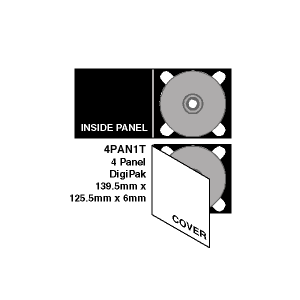
I have decided to use the standard digipak layout as it is commonly used in the acoustic folk genre. This layout will allow me to include a range of things while keeping the theme simple and not over complicated which is one of the main things found in this genre.
This digipak layout will also allow me to use a range of artwork and allow the audience to connect with the artist through the different images used in it. The art work will also allow me to carry out the same theme throughout the website as well as the digipak. This theme will be nature as videos and shots of nature can be seen in our music video. This theme also links with the codes and conventions of indie folk music videos allowing the digipak, production and website to have the same feel to it.
Font style
The main font styles that are found on digipaks in the indie folk genre are very simple as it keeps the digipak simple and clear. In order to follow this trend I have also decided to go with a simple classic font called "Chosence Light".


I have chosen this font as it is classic and is used commonly in this genre of music. This font style will be used throughout the digipak as it will become symbolic as well as linking closely with the band. The font will be the same throughout as it will also allow the fans to recognise the band straight away, it will be used as a band identity which will help sell the brand of the band.

Colour Scheme Research
I have research into the common colour schemes found in indie folk digipaks,
|The main colours that will be found in my digipak are earthly colours such as brown to match the vintage theme that I have planned to use.

Monday, 16 January 2017
Initial Ideas- Digipak
To start my digipak I started with writing down a few ideas about the different images, colour schemes and font styles that I can use. I have listed a few things that link with my production as well as staying true to the codes and conventions of my chosen genre. I now have a general idea about what I will include in my digipak and the sort of theme I will be carrying out throughout my website as well.
Idea 1:
In a general these ideas dark theme to it as it represents the feeling of lose which links back to the song it self, this idea has a dark colour scheme which will allow me to make certain things stand out. However, a disadvantage to this is it does not link in with my chosen genre as much as I would like it to.

Idea 2:
In Idea 2 the main thing that will stand out is the aspect of nature. This is a very good advantage to me as it stays true to the codes and conventions as well as linking in with the production due to the use of naturalistic mise en scenes throughout the production. The colour scheme also gives the digipak the idea of lose and emptiness which links in very well with the lyrics of the production.

Subscribe to:
Comments (Atom)