
A digipak is a marketing product which often includes a certain lay out which include folds, front, back and inside. These digipaks tend to have different styles which vary from one genre to another. These digipaks also include a range of different things such as art work, a certain framing style, a certain appeal to suit the target audience and a way of ordering information for it to be easily seen.
Folds:
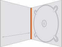
Digipaks often have certain folds which are use to hold in the CD as well as promote the album. The main promoters of the album are the front and back panel as they are used to draw in the customers. The inside of the panel are used to provide more information to the audience. The inside of the digipacks tend to be more toned down that the outside as it does not need to attract the audiences attention but give information. There is also a plastic area which secures the disc in place.
Front:
The front of the digiopak is seen as the most important as it is the thing that will attract the audience attention. There are main things that must be involved in the front which are eye catching pictures which relate to the artist and the song. This allows the audience to make a relation to the artist through the digipak. The name of the song as well as the album are listed on the front as well to insure that the audience know what they are buying.
Back:
The back of the digipak must have some relation to the front through things like the font as well as the art work and artist name. The key features that must be included are a bare code, track list and the record label. These things are always found on the back no matter what genre it is. This allows the shop to sell the record.
Inside:
The inside of the digipak there is the plastic cover as well as the CD, art work which links to the back and the front of the digipak as well as extra information which can be things like lyrics, songs as well as personal messages from the artist. This can be seen as important as the artist is able to connect with the fans by thanking them for buying the digipak.
Examples of design templates:
.jpg)
.jpg)
.jpg)
.jpg)


