
Showing posts with label Digipak. Show all posts
Showing posts with label Digipak. Show all posts
Sunday, 19 February 2017

Thursday, 26 January 2017

Digipak CD- Image
I started by pasting the finished right of the digipak onto the background as I am planning to have the CD and the background the same.

I then cut the main circle for the CD out of the image. After doing so I copied the circle and pasted it on another layer in order to delete the excess part of the image.


I then repeated the same process with the hole in the middle. However, I removed the background too in order to make the hole transparent.`


Digipak Inside Right- Images
I started by copying the image into a separate layer to the background and resized it to get the detail that I wanted it to have.

I then added a filter to carry on with the theme that was running throughout the digipak.

Tuesday, 24 January 2017

Digipak Inside Left- Improvements
After viewing the final design for the digipak I have decided to change a few things in order to make it more representative.
I have used a font from photoshop in order to have more flexibility when editing as well as making it more clear when reading it.
I have also shrunk the picture as the original image was enlarged and the faces were elongated and looked abnormal.
I moved the name of the song in order to give the lyrics more space to make them bigger and readable.
I have used a font from photoshop in order to have more flexibility when editing as well as making it more clear when reading it.
I have also shrunk the picture as the original image was enlarged and the faces were elongated and looked abnormal.
I moved the name of the song in order to give the lyrics more space to make them bigger and readable.
Digipak Inside Left- Text
I pasted the name of the single "let her go" and removed the background of the text.

I then resized it to fit in the place I wanted it to.

I then pasted the lyrics onto the digipak and edited it to fit the exact place I had planned it to fit.

Digipak Front- Improvements
After looking at the digipak I have decided to change a few things in order to make the digipak look more appealing as well as well put together.
I moved the text from the middle to the side in order to make it stand out, I also used a font from photoshop in order to give me more flexibility when editing the font.
I also used colour correct in order to brighten the artists face and make his features clearer
I moved the text from the middle to the side in order to make it stand out, I also used a font from photoshop in order to give me more flexibility when editing the font.
I also used colour correct in order to brighten the artists face and make his features clearer
Digipak Inside Left- Image
I started by making the background and adding the images which had to be made smaller in order to fit on the digipak.

I then added the effect to allow the theme of the digipak to be carried out throughout the whole digipak.


Digipak Front- Text
I then added the text, removed the background and made it smaller in order for it to fit the place I have planned for it to fit.

I then added the album name and removed the background and edited it in order for it to fit where I had planned it to.


Dgipak Front- Image
I started my digipak by putting the measurements of the digipak onto photoshop in order to layer everything on top of it.

I then placed the image on another layer which I wanted to use on the background, however due to the size being too large I had to resize the image.

I then added a sepia effect on the image as it is a common feature found on indie folk music digipaks.

Tuesday, 17 January 2017
Digipak Overview
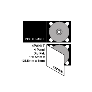
I have decided to use the standard digipak layout as it is commonly used in the acoustic folk genre. This layout will allow me to include a range of things while keeping the theme simple and not over complicated which is one of the main things found in this genre.
This digipak layout will also allow me to use a range of artwork and allow the audience to connect with the artist through the different images used in it. The art work will also allow me to carry out the same theme throughout the website as well as the digipak. This theme will be nature as videos and shots of nature can be seen in our music video. This theme also links with the codes and conventions of indie folk music videos allowing the digipak, production and website to have the same feel to it.
Font style
The main font styles that are found on digipaks in the indie folk genre are very simple as it keeps the digipak simple and clear. In order to follow this trend I have also decided to go with a simple classic font called "Chosence Light".


I have chosen this font as it is classic and is used commonly in this genre of music. This font style will be used throughout the digipak as it will become symbolic as well as linking closely with the band. The font will be the same throughout as it will also allow the fans to recognise the band straight away, it will be used as a band identity which will help sell the brand of the band.

Colour Scheme Research
I have research into the common colour schemes found in indie folk digipaks,
|The main colours that will be found in my digipak are earthly colours such as brown to match the vintage theme that I have planned to use.

Friday, 25 November 2016


Thursday, 24 November 2016
Conventions of Digipaks

A digipak is a marketing product which often includes a certain lay out which include folds, front, back and inside. These digipaks tend to have different styles which vary from one genre to another. These digipaks also include a range of different things such as art work, a certain framing style, a certain appeal to suit the target audience and a way of ordering information for it to be easily seen.
Folds:
Front:
The front of the digiopak is seen as the most important as it is the thing that will attract the audience attention. There are main things that must be involved in the front which are eye catching pictures which relate to the artist and the song. This allows the audience to make a relation to the artist through the digipak. The name of the song as well as the album are listed on the front as well to insure that the audience know what they are buying.
Back:
The back of the digipak must have some relation to the front through things like the font as well as the art work and artist name. The key features that must be included are a bare code, track list and the record label. These things are always found on the back no matter what genre it is. This allows the shop to sell the record.
Inside:
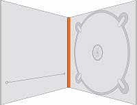
The inside of the digipak there is the plastic cover as well as the CD, art work which links to the back and the front of the digipak as well as extra information which can be things like lyrics, songs as well as personal messages from the artist. This can be seen as important as the artist is able to connect with the fans by thanking them for buying the digipak.
Examples of design templates:
.jpg)
.jpg)
.jpg)
.jpg)
Subscribe to:
Posts (Atom)